Overview
UBYou is an app designed to help college students access campus-specific mental health and wellness resources. By providing a tailored platform, UBYou aims to create a personalized, engaging, and easy-to-navigate experience that empowers students to prioritize their well-being.
Problem Statement
College students often struggle to access mental health and wellness resources in a way that feels seamless, engaging, and personalized. UBYou’s current design faces three key challenges: the home page lacks visual hierarchy, making it difficult for users to navigate and prioritize information; the wellness check-in flow is underdeveloped, limiting meaningful engagement; and the organization of resources is overwhelming, with insufficient personalization to meet individual student needs. These issues prevent UBYou from effectively connecting students with the support they require, highlighting the need for a thoughtful redesign to improve usability and user engagement.
Solution
To address the key challenges in UBYou’s design, our team implemented a series of targeted improvements. We redesigned the home page with a clear visual hierarchy to make navigation intuitive and prioritize key information. The wellness check-in flow was expanded and enhanced with engaging, gamified elements to foster regular use and provide meaningful insights for users. Additionally, we reorganized and personalized the resources, creating a structured and approachable layout that reduces overwhelm and ensures students can easily find the support tailored to their individual needs. These changes were designed to create a seamless and engaging experience that empowers students to prioritize their mental health and wellness.
Users + Audience
UBYou’s primary audience is college students seeking accessible and personalized mental health and wellness support. These users often juggle demanding academic schedules, social pressures, and personal challenges, leaving them little time to navigate complex or poorly organized platforms. They value simplicity, clear guidance, and engaging features that help them address their mental well-being without adding additional stress. The redesign focused on creating an experience that resonates with these users by prioritizing ease of use, personalization, and a visually engaging interface tailored to their needs.
My Role
As the team lead for the UBYou redesign project, I was the main point of contact with the client, ensuring consistent communication and managing project expectations. I sent out weekly meeting agendas and follow-up notes to keep the team and stakeholders aligned. My responsibilities also included defining the project scope, creating user stories, and leading brainstorming sessions to generate design solutions. I contributed to the research, wireframing, high-fidelity design, and prototyping stages while ensuring our team maintained cohesion throughout the process. Additionally, I managed timelines, provided constructive feedback, and ensured that our deliverables met the expectations of both the stakeholders and the end users.
Discover
In the Discover phase, we focused on understanding both the landscape of existing solutions and the specific needs of our users. To guide our design process, we conducted two key activities:
• Competitor Analysis: We analyzed platforms in the mental health and wellness space to identify design patterns, features, and pain points that could inform the UBYou redesign.
• User Stories: We created user stories to capture the unique needs, frustrations, and goals of our target users, ensuring that our solutions were aligned with their expectations.
Competitor Analysis
Apps like Headspace and Calm inspired us with their user-friendly meditation flows and clear navigation, which we aimed to replicate in UBYou for a smooth experience. Duolingo's use of gamification, such as rewards and progress tracking, offered valuable insights to boost user engagement. We also analyzed Tao (Therapy Assistance Online) and You at College, which focus on mental health and campus resources but lack personalization and engaging features. This highlighted opportunities for UBYou to offer a more tailored, intuitive, and motivating experience with personalized content and gamified elements to encourage regular engagement.
User Stories
Based on insights gathered from user research and the competitive landscape, we developed user stories that captured the primary goals and pain points of UBYou’s users:
• As a new user, I want to easily navigate the app so I can quickly find relevant mental health and wellness resources.
• As a student, I want content that is personalized to my specific needs and preferences, so I can engage more meaningfully with the platform.
• As a user, I want regular reminders and engaging features that motivate me to prioritize my well-being and check in often.
• As a student, I want to easily access campus-specific mental health resources without feeling overwhelmed by a cluttered interface.
These user stories helped guide our design decisions, ensuring that UBYou would be intuitive, personalized, and motivating to engage with regularly.
Define
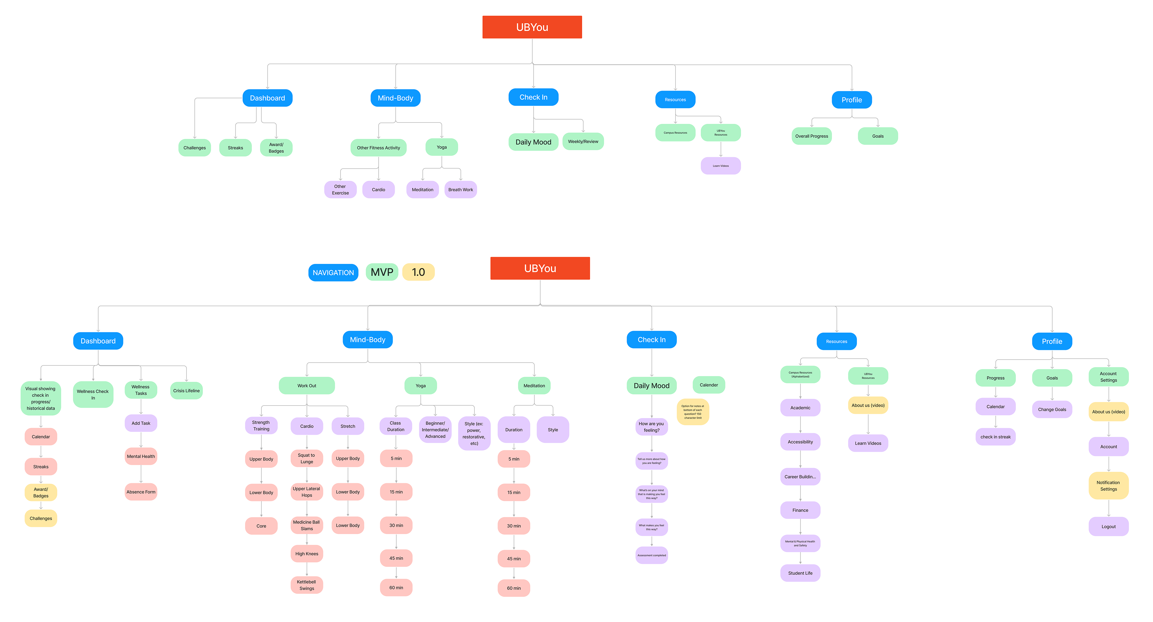
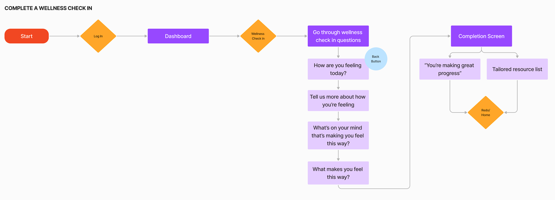
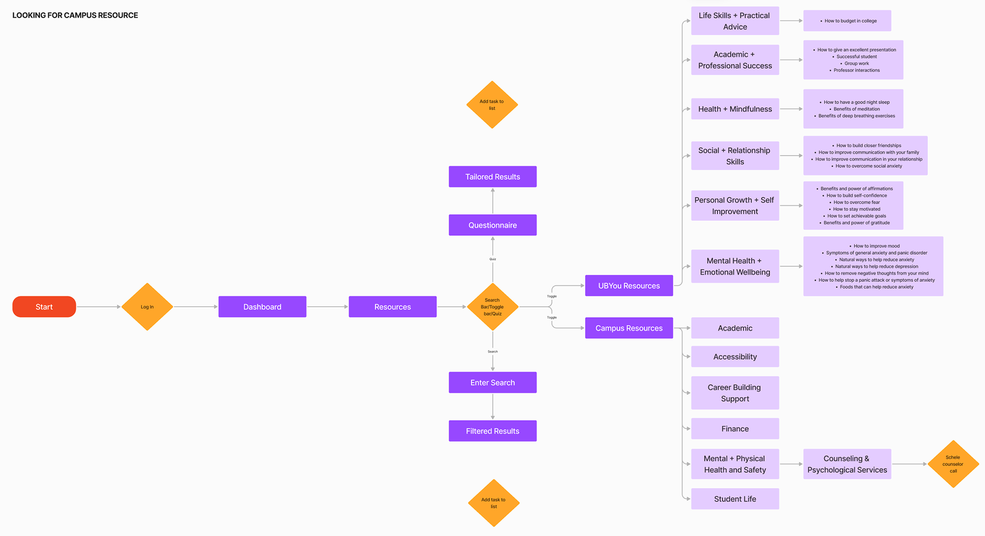
In the Define stage, we took the insights from the Discover phase and focused on mapping out key problem areas and solutions. The team identified the primary red routes, or the most critical paths users take in the app, that needed improvement. We also created a sitemap to outline the structure of the app, ensuring clear navigation. Additionally, we designed user flows for two primary red routes to guide users through their most essential tasks, such as checking in for wellness tracking and accessing personalized mental health resources.
Identifying Red Routes
We focused on the most important user journeys including the wellness check in and navigating UBYou and campus resources, which were identified as critical to the user experience.
SitemapPing
The sitemap helped clarify the app’s structure and ensure smooth navigation across different sections of the platform.
User Flows
We created detailed user flows for two key red routes: completing a daily wellness check-in and scheduling a counselor call through campus resources, making sure each flow was intuitive and streamlined.
Design
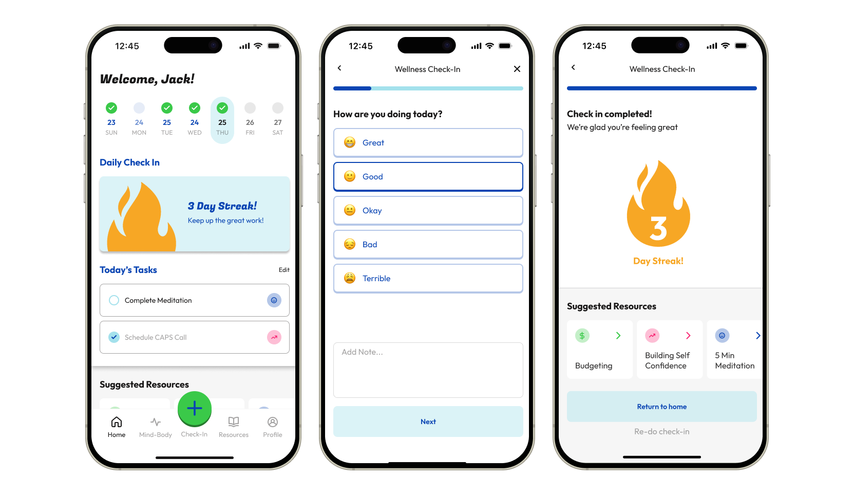
With clear insights and defined red routes from the earlier stages, we moved into the Design phase to bring our ideas to life. This phase focused on creating visually cohesive, intuitive, and engaging designs for the wellness check-in flow, resource tab, and home page.
Wireframes
We began by creating low-fidelity wireframes to explore layouts and flows, ensuring our solutions were user-centered and functional. For the home page, we conducted Crazy 8’s, a rapid ideation technique, to generate a variety of design ideas and determine the most effective approach for improving visual hierarchy and engagement.
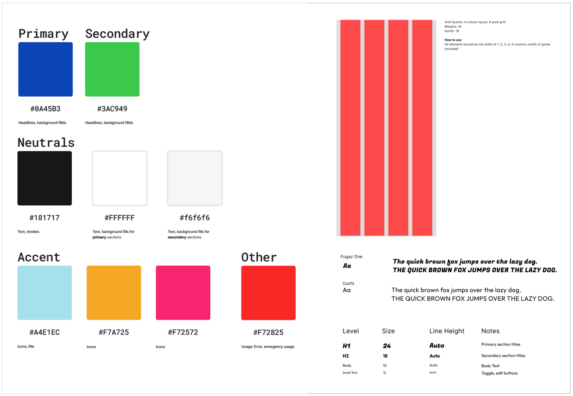
Style Guide
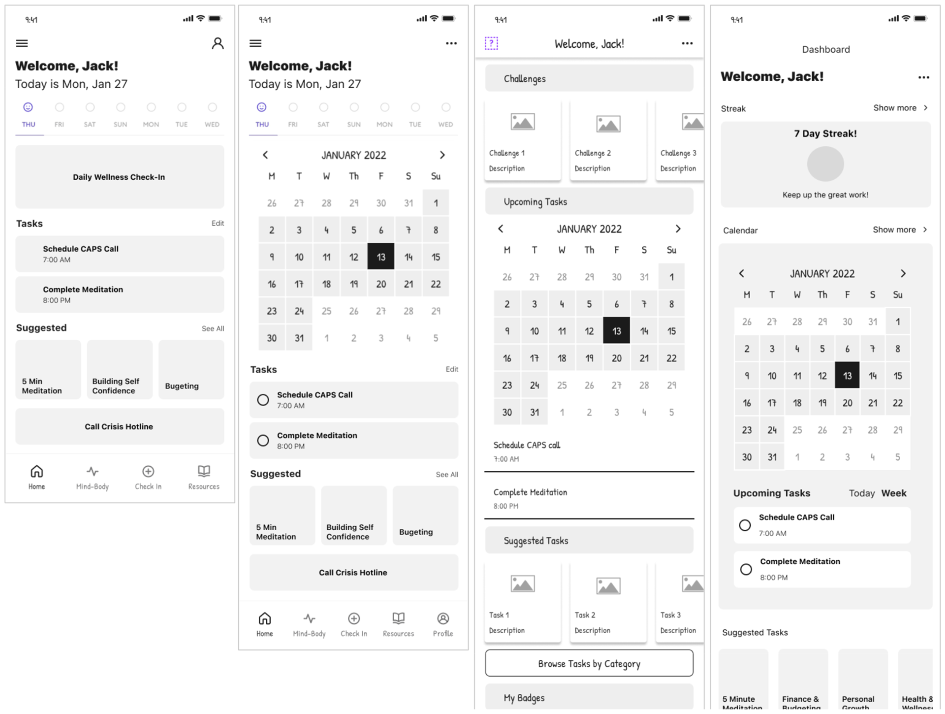
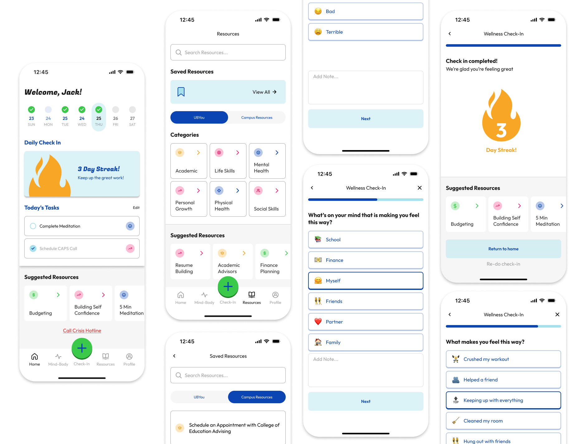
High-Fidelity Mockups
Outcomes + Results
Our redesign of UBYou resulted in a more user-friendly, engaging, and intuitive platform for college students seeking mental health and wellness support. Key achievements included:
• Enhanced User Engagement: The redesigned home page with improved visual hierarchy and interactive features provided a more inviting experience, encouraging regular use of the app.
• Streamlined Flows: The updated wellness check-in and counselor booking flows reduced friction, making it easier for users to complete key tasks.
• Personalized Experience: Organizing resources and tailoring features to individual needs minimized overwhelm and improved accessibility for students.
• Positive Stakeholder Feedback: The client praised the new designs for addressing user pain points and aligning with their goals for the platform.
The project successfully addressed the app’s main challenges and laid the foundation for further development, ensuring students can access resources that are both practical and engaging.
Challenges
Working on UBYou presented several challenges that pushed us to think critically and adapt throughout the design process. One significant challenge was ensuring the app balanced usability with personalization without overwhelming users. College students are often inundated with information, so we had to design features that felt intuitive and streamlined while addressing their diverse needs.
Another challenge was collaborating effectively as a team, particularly when iterating on designs or aligning on project priorities. Balancing everyone’s ideas and feedback while staying true to user needs and project goals required strong communication and flexibility.
Lastly, as team lead, I faced the added responsibility of managing client communication, creating meeting agendas, and following up on action items. Juggling these administrative tasks with design work was a test of time management and organization.
Lessons I Learned
This project offered invaluable insights into the UI/UX design process and collaborative teamwork. One major takeaway was the importance of iteration. Through Crazy 8’s, wireframes, and feedback loops, I learned that no design is perfect on the first try, and constant refinement is key to creating user-centered solutions.
Another lesson was how critical clear communication is, both within the team and with stakeholders. Regular updates, transparent discussions, and aligning on goals ensured we stayed on track and met the client’s expectations.
Prototype